

Problem:
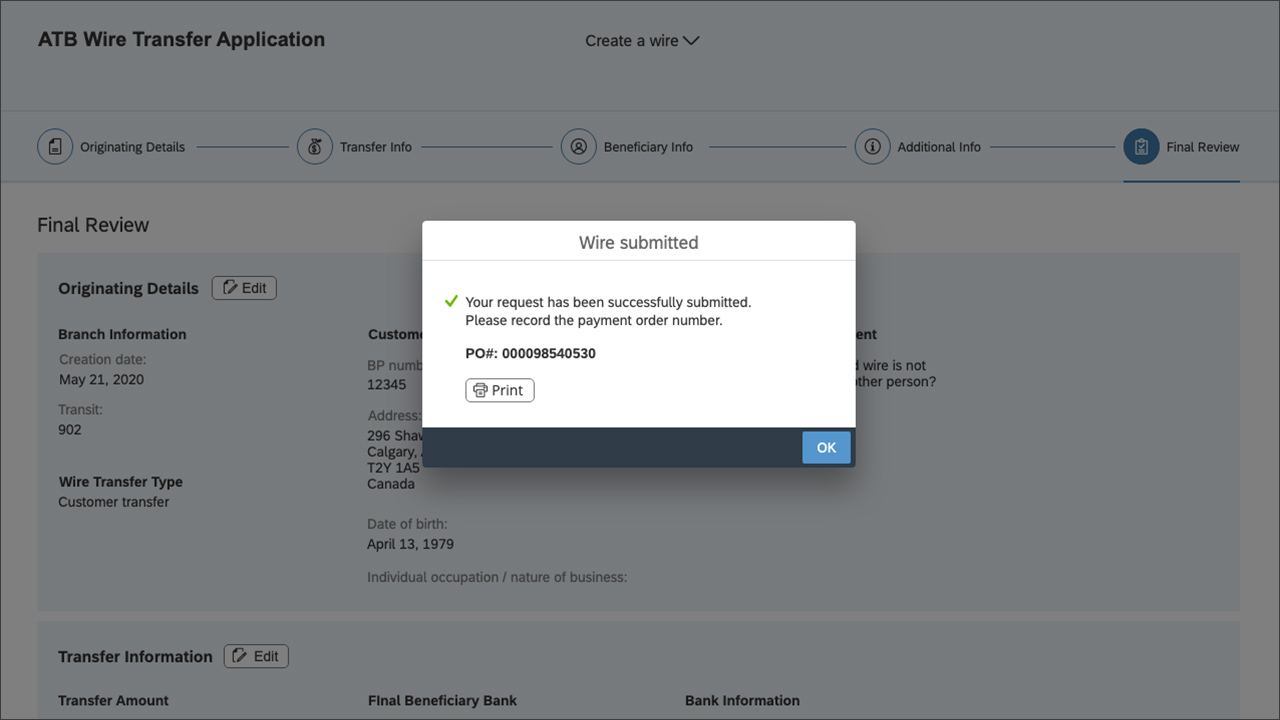
ATB’s team member-facing wire transfer app required a significant compliance update. Feedback from team members indicated that the tool was outdated, slow, and difficult to use. As a result, it was decided to redesign the tool to enhance the user experience while incorporating the necessary compliance requirements.
Solution:
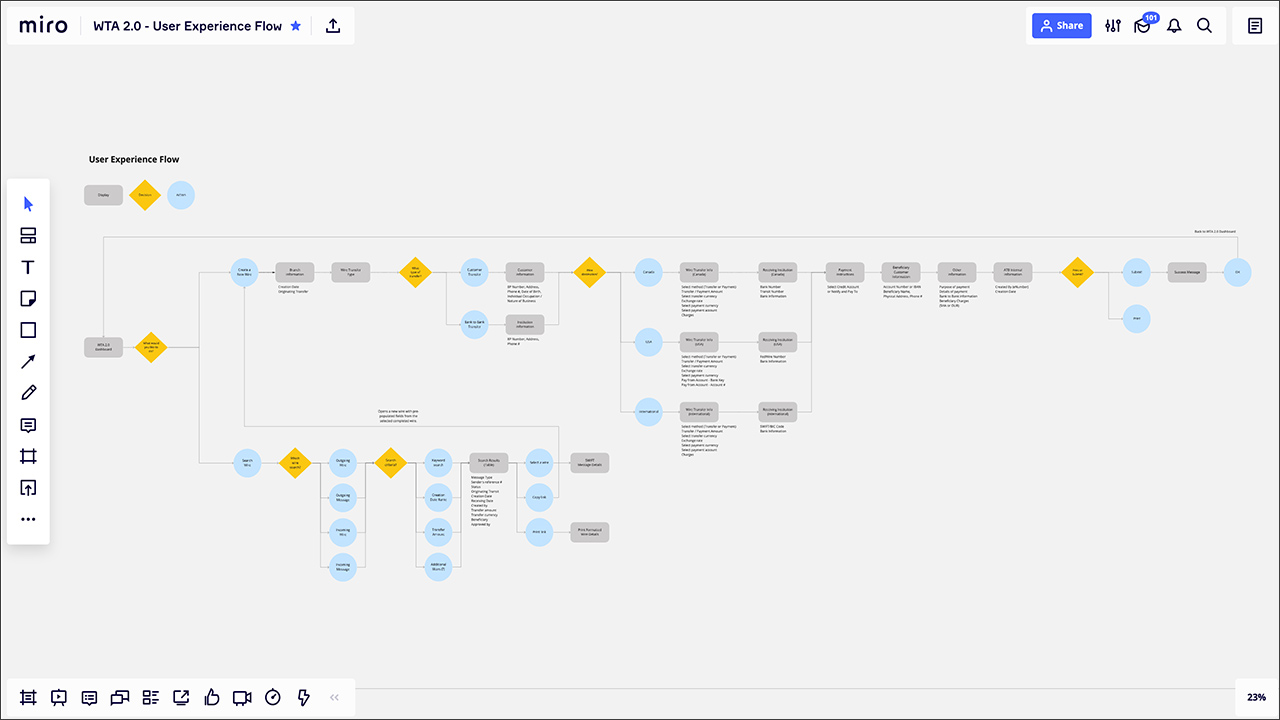
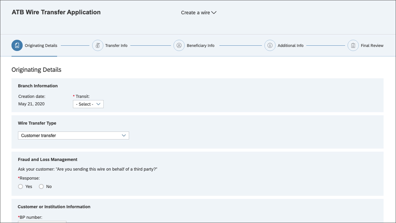
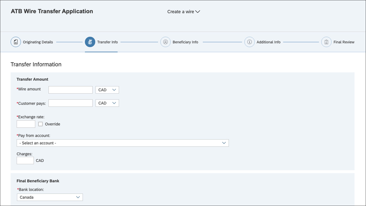
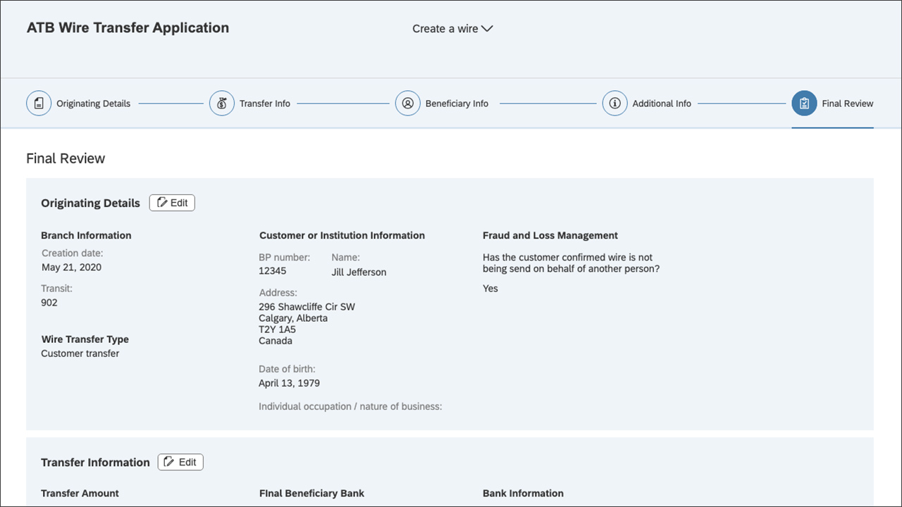
During the initial planning stages, we identified areas where the information architecture and user flow could be improved to enhance the experience. Required content, both existing and new features, was documented in Confluence. High-fidelity prototypes were designed in Axure based on the Fiori design guide and UI library. These prototypes were tested for validation, refined, and then translated into stories for our development team to build.
Result
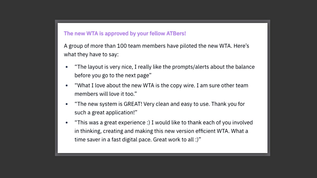
Team members were highly satisfied with the redesigned wire transfer app. They praised its clean and user-friendly interface, noting the significant improvement in experience and time savings.
Team:
I collaborated with an analyst, product owner, researcher, and information architect. I also worked closely with Fiori developers who were building the application. They contributed valuable technical input and ideas during the design ideation process, while I provided design oversight throughout production.